


Posts on Current Forum | Archived Posts
|
||||
|
||||
|
||||
| Frequently Asked Forum Questions | ||||
| Search Older Posts on This Forum: Posts on Current Forum | Archived Posts | ||||
There's still a big difference between these two:


And this:
: I agree that some of the H2A maps are too filtered - but punching up the
: colors isn't always the answer.
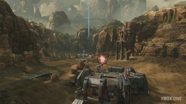
No, but having a better and more varied color pallet is. Blood Gulch and Coag did have green and blue. A lot of it. Bloodline has brown dirt, brown grass, brown trees, and brown sky. It's like the whole world was sculpted out of dirt, mud, and shit, with a thick layer of dust and smog choking the sky. Bloodline is an ugly, ugly map. Drab, colorless, and just doesn't look like something you'd expect to see in Halo. I'm sick to death of brown shooters. It's a dead horse trope at this point. Even the usually gaudy Covenant didn't escape, with duller purples and less ostentatious armor colors.
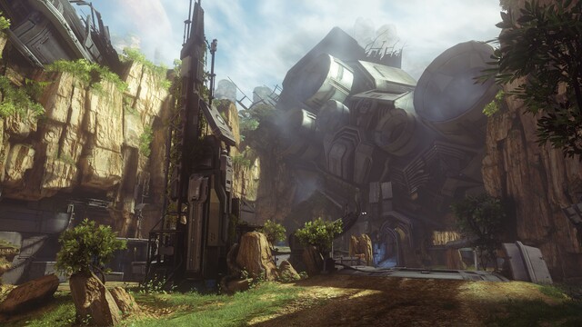
At least what we've seen of the remastered H2 Campaign looks nice, with lots of different colors everywhere. The thing is is that the MP doesn't have to look like it does. While Halo 4 and H2A MP generally have washed out colors, there are some parts that are relatively vibrant in comparison. The level Infinity in H4's Campaign is filled with lush greenery, Midnight has vivid "Tron lines" everywhere to highlight the steel architecture, the remake of Zanzibar has blue skies and splashes of greenery, even Zenith manages to have yellowy sand, silver structures, and bluish sky contrasting, as seen here:

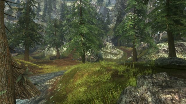
Hell, they could have given Bloodline a color pallet more like Exile's:
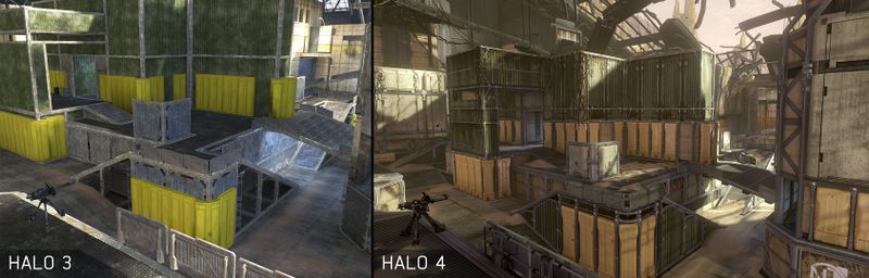
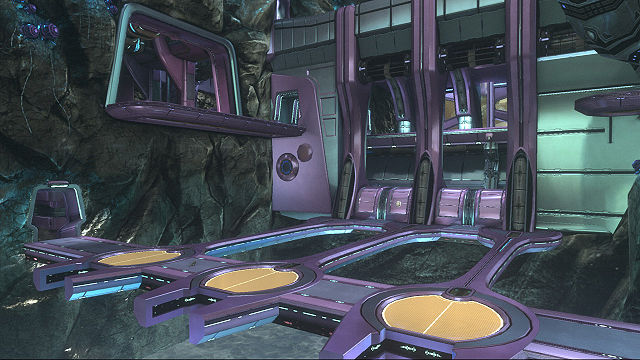
I don't know if it's because individual levels have different people working on their visual assets or what, but the potential for color in things made with the Halo 4 engine are there, but it's rarely used, and on the whole Halo 4 and H2A MP are on average far more dull and dingy than what was typical in early games. And I don't think it's just because Certain Affinity just suddenly developed a certain affinity for brown. Yeah, they did manage to make The Pit, which had fairly contrasting colors, into the almost sepia-toned Pitfall:
But they also gave us these:
And they even managed to make Headlong more colorful than the original:

Even when Bungie wasn't making the content themselves, things were more colorful when the franchise was in their hands. Bloodline is by far the single worst-looking environment in Halo history, and the fact that it's a remake of a classic map makes it sting even more. Shrine (another map where everything is brown) and Lockdown (ghastly glaring sepia lighting that makes my eyes bleed) aren't too far behind it. They're total messes visually. Whoever was responsible for those should be transferred to the studio making the new Gears of War because it would be a better visual match. I really hope these levels look better in person than what pictures and videos on the internet suggest.