

Posts on Current Forum | Archived Posts
|
||||
|
||||
|
||||
| Frequently Asked Forum Questions | ||||
| Search Older Posts on This Forum: Posts on Current Forum | Archived Posts | ||||

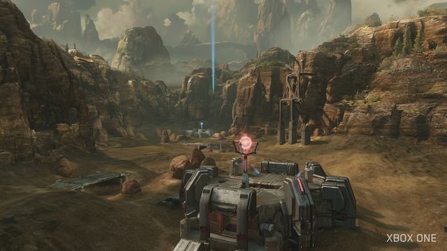
And how Sanctuary has touches of green trees and a blue sky, contrasted against the near-uniform brownness of Shrine:


And how blue Lockout is compared the unnatural glare of peach-ish lighting seen on Lockdown:


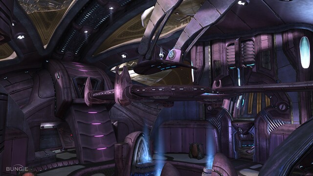
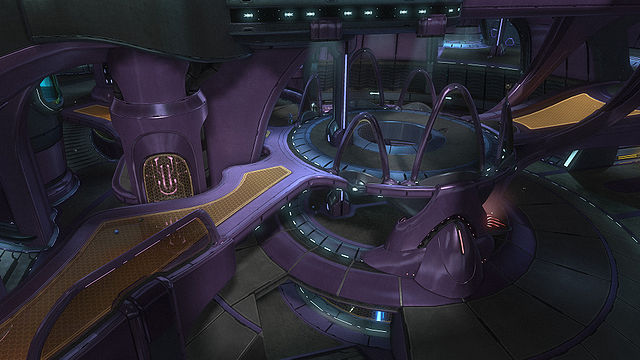
And how the purples and other hues of Midship, Heretic, and Zealot contrast to the Halo 5 remake of Midship, which has the purples swamped out by dark, gloomy blue light that dominates everything:

And, well, you get the point. 343I-era Halo more often than not just isn't pleasant to look at. Cleaner lines, more vibrant colors or at least colors that contrast better, less harsh lighting. These things would help make 343I's visual assets easier on the eyes.